Own concept
Urban Mobility Multi-mode ride booking app
Mobile app · Smart city mobility · Figma
- Project
- Own concept
- Role
- Idea to mobile app: research, UX, UI
- Type
- Mobile app
Overview
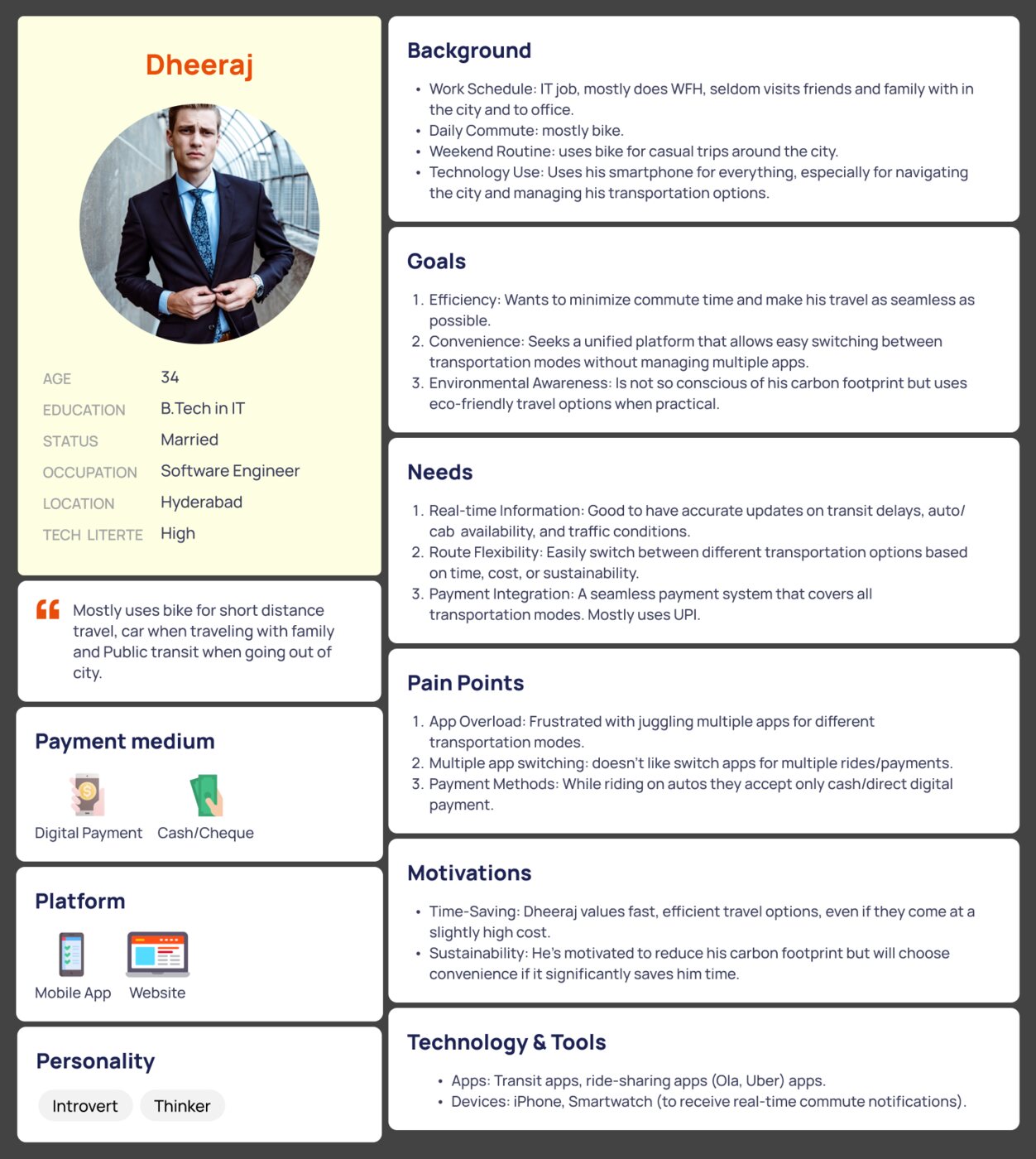
This case study outlines the mobile app design of a Multi-Mode Ride Booking App, aimed at simplifying the urban commuting experience by offering a unified platform for public transport, ride-sharing, eco-friendly and trip planning. The app is targeted primarily for 2 personas: Dheeraj, a daily city commuter. Sayantan, a visitor looking to explore the city.
The challenge
Urban commuters, whether city residents or visitors, often face challenges when using separate apps for various tasks, such as traveling from point A to point B or exploring the city in an eco-friendly and cost-effective way across different transport modes. Coordinating multi-modal trips—switching between public transport, ride-sharing, journey tracking, sharing rides for live tracking, and managing seamless payments and ticketing—can be particularly cumbersome.
Goals
- Seamless Multi-Mode Integration: The goal was to design an app that merges public transport and ride-sharing services in one interface, allowing for easy trip planning and booking.
- User-Centric Design: Create a smooth experience for two user types—commuters and tourists—catering to their unique needs like frequent routes, real-time data, and city exploration.
- Simplified Payments: Implement an integrated payment system covering all transport modes, with easy comparison and real-time cost updates.
- Accessibility and Personalization: Ensure the app is inclusive and adapts to user preferences and needs, such as language options, real-time updates, and eco-friendly routes.
Research insights
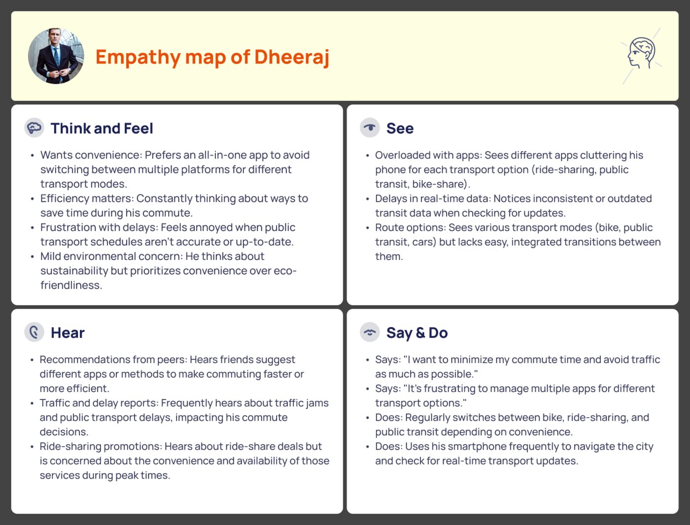
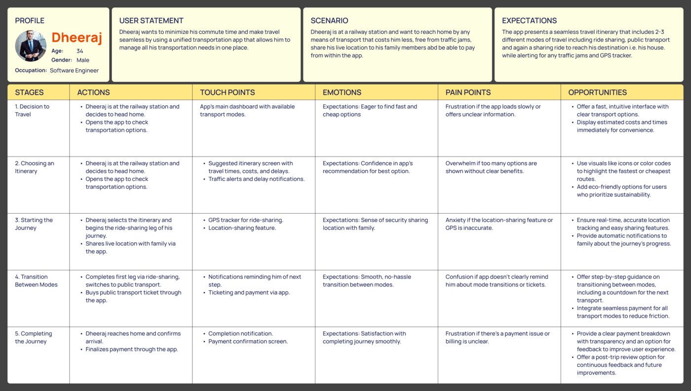
- Commuter Insights: Users like Dheeraj prioritize efficiency and reliability. They want quick access to saved routes, real-time data on transport availability, and minimal friction in booking and payment.
- Visitor Insights: Users like Sayantan value ease of discovery. They want to explore the city efficiently, requiring more guidance in terms of attractions, transportation suggestions, and possibly integrated tickets for tourist spots.
These insights informed the IA, ensuring that features like Saved Routes, Trip Planner, and Explore City were prominent.
Process
Design Thinking; User centered Design.
Tools: Figma.
UX artifacts: Questionnaire, User Interviews, Personas, Empathy Maps, User Journey Maps, Paper Sketches, Wireframes, Visual Designs, IA.
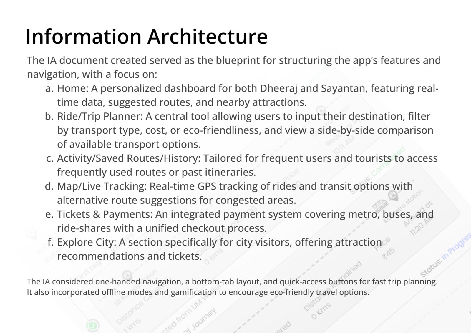
Information architecture
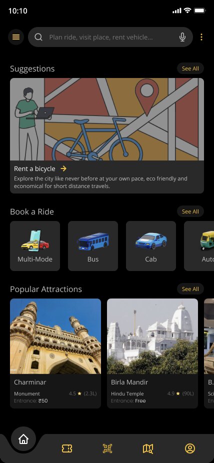
- Home: personalized dashboard with real-time data, suggested routes, nearby attractions
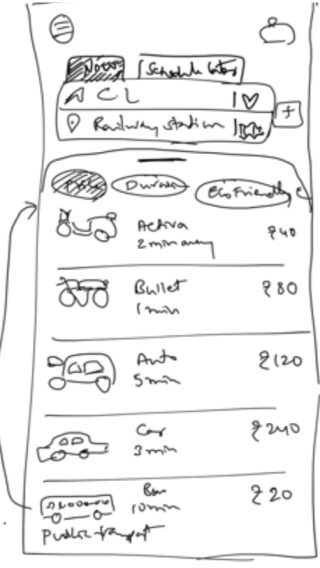
- Ride/Trip Planner: destination, filter by transport type, cost or eco-friendliness, side-by-side comparison
- Activity/Saved Routes/History
- Map/Live Tracking: real-time GPS, alternative routes for congested areas
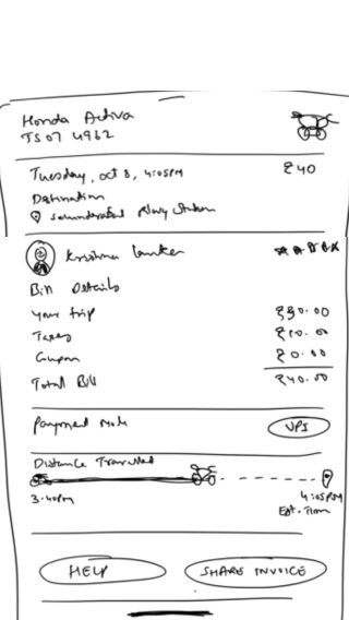
- Tickets & Payments: metro, buses, ride-shares, unified checkout
- Explore City: attractions and tickets
The IA considered one-handed navigation, a bottom-tab layout, and quick-access buttons for fast trip planning. It also incorporated offline modes and gamification to encourage eco-friendly travel options.
Wireframes & user flows
- Bottom tab bar (Home, Trip Planner, Saved Routes, Map)
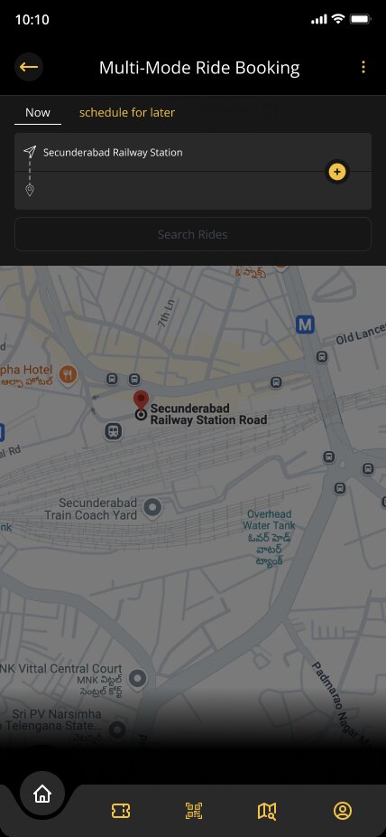
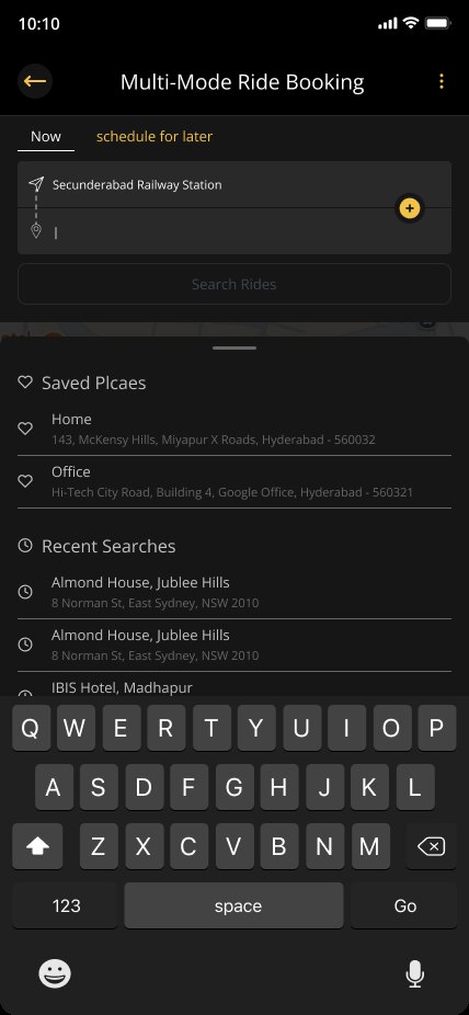
- "Search Rides" with real-time nearby options
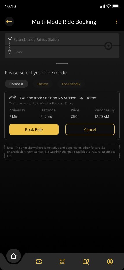
- Real-time availability, delays and pricing for all modes
- Checkout with multiple payment methods and one-tap payments for repeated routes
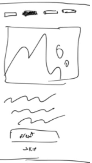
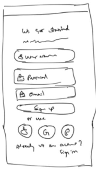
Paper sketches first, then the user flows that joined them.
Final UI
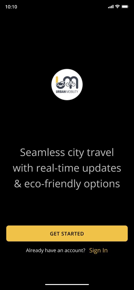
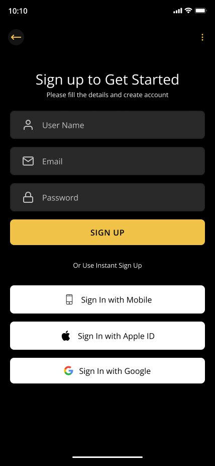
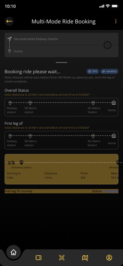
The booking flow, from the first launch to a ticket.


Design highlights
- Visual Design: clear typography, iconography, and color contrast ensures usability in both low-light and outdoor conditions.
- Personalization: save routes, set preferences for eco-friendly travel, personalized recommendations.
- Accessibility: large touch targets, voice-based search, and support for multiple languages.
Outcome & learnings
The final app design will provide an intuitive and user-centric solution for both commuters and tourists. Key metrics like user retention, task success rate, and satisfaction scores will indicate the app's success.
Key learnings:
- Personalisation plays a crucial role in improving user satisfaction, especially when designing for diverse user personas.
- Real-time data and quick-access buttons significantly enhance the commuting experience, reducing user effort.
- Iterative usability testing is essential to refine complex features like multi-mode payment integration and trip scheduling.